


Role
UI/UX Designer - Focus on Prototyping & Collaborative Design
I was primarily responsible for prototyping high-fidelity interfaces and interactions.
As part of a team of 8, I also actively participated in design critiques, user flow discussions, and overall UX decision-making. Since this was a learning environment, I took every opportunity to contribute to broader design thinking and product problem-solving
Duration: 4 Weeks | June 2025
Program: MySkill UI/UX Design Bootcamp
Problem
MAXIM’s UI lacks clarity and trust
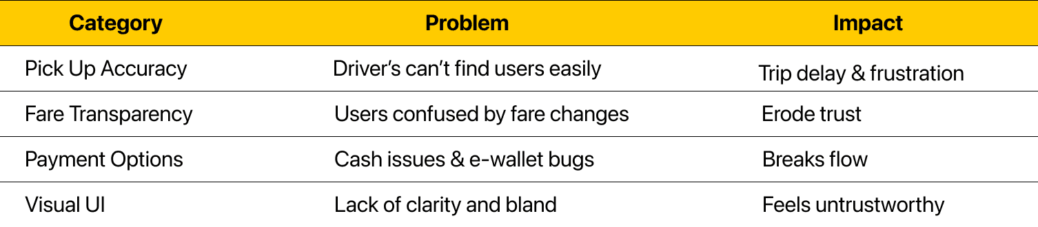
While Maxim offers the lowest fares compared to its competitors, users struggle with:
Map inaccuracy and poor coordination with drivers
Unexpected fare changes with unclear explanations
Limited payment options and e-wallet issues
Lacks visual appeal and clarity
These issues reduce user trust and retention, especially compared to stronger competitors like Gojek and Grab.
Goals
Rebuild trust and usability through UI improvements and clearer communication
We focused on:
Increasing trust in fare accuracy and driver transparency
Reducing friction in setting pick-up locations
Making payment more flexible and reliable
Improve UI clarity and visual appeal without sacrificing simplicity
Contribute meaningfully to business performance
Research
Uncovering Insights to Understand the Ride-Hailing User Experience
We collected feedback from 41 users on the Apple Store (during May–June 2025) and conducted in-depth interviews with 5 users to gain deeper insights into their experiences, needs, and pain points.


Some of Users Feedback


virtual interview
Findings:
Users need more payment method options, as drivers often don’t have change for cash, and the e-wallet system doesn’t work reliably.
Users feel the UI and copywriting could be more engaging, while still staying clean and minimal.
Users want to see a more complete driver profile, including years of activity and recent ratings.
Users don’t see enough information about the differences between service types in the homepage.
Pain Points:
System
When users can’t set an accurate pickup point, their only option is to call or text the driver through the app, an ineffective solution, especially when the signal is poor, making coordination more difficult and frustrating.
Trust
Users don’t receive clear information about what causes fare changes during the trip. Inconsistent explanations from different drivers lead to user skepticism and distrust.
Security & Safety
Users are unwilling to accept drivers’ requests to order rides offline. It makes them feel insecure and uncomfortable, as there's no official record of the trip, unexpected charges can occur, and they lose the ability to report bad experiences to the company.
User Journey Map
We identified pain points at each stage of the user journey when using the ride-hailing service and uncovered opportunities for improvement.

Design
Based on mentor feedback and our design explorations, we implemented 3 improvements to enhance the user experience.
Exploration
Home Page
Exploration 1


Exploration 2

The ‘Order’ button appears active before the user completes the mandatory input fields, which can cause confusion.
The order button remains disabled until the user completes the mandatory input fields, helping them focus on entering the pick up and destination.
The voucher element has been relocated from the menu page to the homepage, making it more visible and accessible to users.
The voucher element was relocated from the menu page to the homepage, making it more visible and accessible. A vibrant background color was applied to enhance its visual appeal.
1st Improvement
Home Page
User Problem:
Not useful information about the type of service
Inconsistent copy
Voucher hard to access
Limited payment method
Unattractive UI
The Solution:
Clarify service type differences
Ensure copy consistency
Make vouchers easy to access
Add QRIS as a direct non-cash payment option
Add Batik motifs & city label
Business Impact:
Increases successful payments & trip volume
Encourages repeat usage & boosts engagement
Before


After


Competitor Analysis
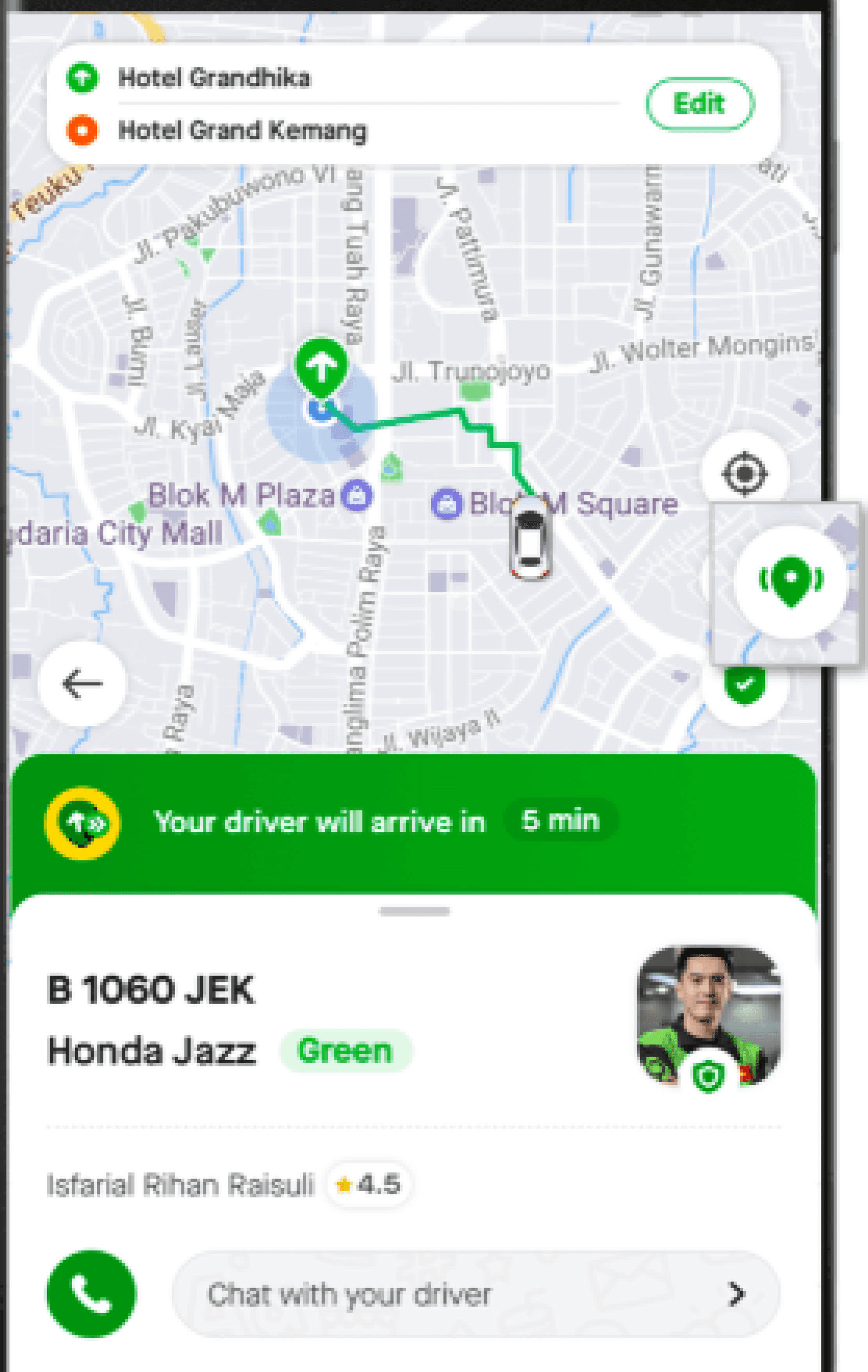
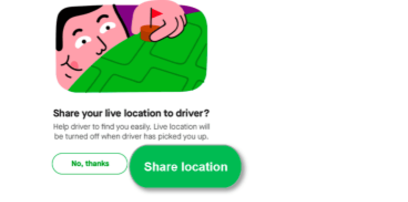
We analyzed how competitors address map inaccuracies, especially in remote or densely populated areas, and found that they use share-live location technology to help drivers navigate more accurately.


2nd Improvement
Share-Live Location
User Problem:
Map inaccuracy causes confusion for both users and drivers, especially when poor signal disrupts communication.
The Solution:
Introducing a share-live location feature to help drivers reach the pick-up point accurately, reducing the need for direct communication.
Business Impact:
Fewer failed trips → higher ride completion
Before

After


3rd Improvement
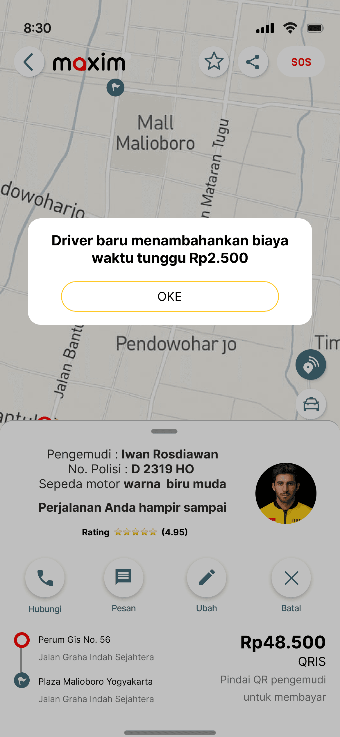
Real-time Add. Charge Notification
User Problem:
Unclear fare changes and poor driver communication reduce user trust.
The Solution:
Inform users about paid waiting fees in the driver arrival notification
Provide real-time updates on any additional charges
Business Impact:
Reduces user complaints & support inquiries
Before

After

THE FINAL SCREENS


Prototype Link
Validation
We conducted usability testing and received a score of 84%, which shows that most users were able to complete the given tasks. While we’re glad the design is generally usable, we also recognize areas that can be improved and look forward to iterating further based on user feedback.

Usability Testing Table
What We’d Do Differently Next Time?
This was our first case study, and we were truly excited to complete it and experience the full design process. Through this project, we learned several valuable lessons:
Accessibility (WCAG)
We acknowledge that we overlooked accessibility standards in this project. Moving forward, we plan to apply WCAG guidelines to ensure our designs are inclusive and user-friendly for everyone.
Business Perspective
In this project, we made an intentional effort to connect UX decisions with potential business impact, such as improving payment completion, increasing voucher usage, and reducing trip failures. While we didn’t have access to actual business data or KPIs, we hypothesized outcomes and framed our design accordingly.
Moving forward, I aim to deepen this practice by collaborating more closely with stakeholders and aligning design metrics directly with product and business goals.
email: argia.pandu@gmail.com
contact: 0812 2060 9199
Back to Top